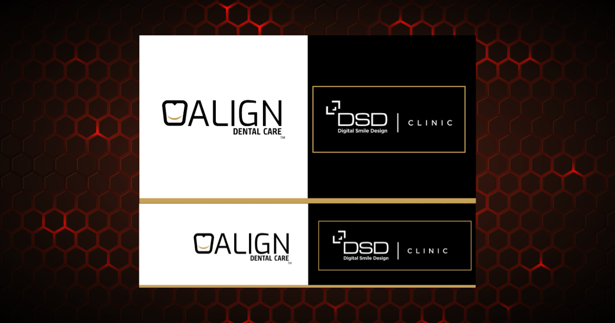
We developed a comprehensive corporate identity system for ALIGN Dental Care in partnership with the Digital Smile Design (DSD) Clinic. The challenge was to merge two sophisticated medical dental brands into a single, cohesive visual ecosystem while maintaining the premium, trustworthy aesthetic required for high-end healthcare services. The resulting design package includes high-impact outdoor signage, corporate flag elements, and custom A-board displays. By utilizing a luxurious monochrome layout accented with elegant gold tones, the final branding projects an image of cutting-edge precision, clinical excellence, and high-end patient care. Strategy We began with an in-depth brand analysis to seamlessly bridge the advanced clinical focus of ALIGN Dental Care with the artistic precision of Digital Smile Design (DSD). Our strategy centered on creating high-impact visual assets that immediately convey trust, luxury, and medical excellence to elite clientele Design The visual language balances clean, modern typography with a high-end color palette. Utilizing a structured dark background contrasted with crisp white grids and subtle gold highlights, the final designs establish a premium, sophisticated aesthetic across all physical and digital platforms. Features Unified dual-brand visual framework Production-ready vector assets for signage Premium monochrome & gold color grading Scalable formatting for wide-format printing Modern, minimalist typography hierarchy This case study details the complete corporate identity development and physical marketing asset design for ALIGN Dental Care in partnership with the Digital Smile Design (DSD) Clinic. The scope of the project required establishing a unified visual language across multiple commercial formats, ensuring that two distinct medical sub-brands could seamlessly coexist on premium clinic signage without losing their unique identity markers. Understanding Brief Research Design Process We began by thoroughly analyzing the requirements provided by the client for the ALIGN Dental Care and DSD Clinic project. The core objective was to map out how these two distinct medical sub-brands could seamlessly merge into high-end physical marketing materials. Understanding their target audience allowed us to define a clear creative direction focused on luxury, cleanliness, and clinical authority. Our research phase involved analyzing top-tier international dental practices and medical clinics to identify premium design trends. We studied optimal typography scales, geometric grid layouts, and color psychology to ensure the black, white, and gold theme would stand out in real-world environments. We also researched material and printing specifications for flags and A-boards to ensure production-ready accuracy. During the design phase, we translated our research into high-fidelity vector layouts using precision grids. We focused on the perfect mathematical alignment of both logos, establishing a balanced visual hierarchy that ensures neither brand overshadows the other. Contrast and line weights were rigorously tested to guarantee that the final physical signs look stunning and professional from any viewing distance. Throughout the execution of this project, maintaining absolute brand integrity for both ALIGN Dental Care and the Digital Smile Design (DSD) Clinic was our highest priority. By utilizing balanced geometric structural templates and precise spatial grid configurations, we ensured that both corporate identities are displayed with crystal-clear prominence across all physical assets without visual overcrowding.