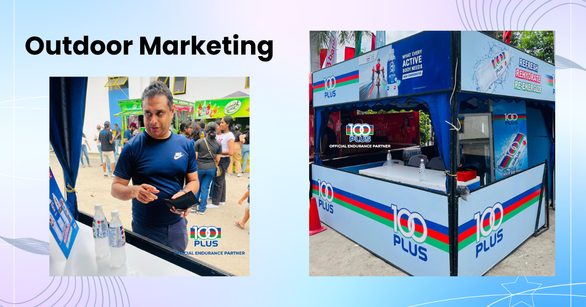
Designed and executed the comprehensive outdoor marketing setup for 100PLUS, the world-famous isotonic sports drink. I managed the end-to-end visual strategy, transforming the brand’s iconic blue, red, and green identity into a dynamic, 360-degree experiential booth. The project required precise spatial layout planning and large-format asset creation to ensure the structure stood out in a high-traffic environment, successfully driving consumer engagement and reinforcing 100PLUS as the ultimate hydration choice. Strategy Developing a high-visibility framework to ensure the 100PLUS brand stood out in crowded, fast-paced outdoor event environments. The core approach relied on strategic placement and mapping layout lines that instantly draw the eye from any angle, maximizing consumer reach and foot traffic. Design Translating the energetic, iconic identity of 100PLUS into large-format reality. By combining bold typography, crisp lines, and the brand’s distinct color trio, I crafted a cohesive 360-degree visual experience that is both inviting to attendees and perfectly aligned with global brand guidelines. Features 360-Degree Branding High-Impact Visibility Large-Format Precision Cohesive Identity Event-Ready Layouts Bringing a world-famous beverage brand to life in the physical environment requires an absolute balance of bold visuals and careful spatial planning. For this 100PLUS outdoor marketing campaign, I took charge of the complete creative pipeline—from initial layout strategy to final print-ready design execution. The main goal was to turn a standard functional kiosk into an energetic brand hub that echoes the refreshing, active spirit of the drink. Every aspect of the design—including the overhead canopy valances, structural pillars, and front-facing counter wraps—was strategically crafted to guarantee high visibility. By maintaining exact color accuracy and brand consistency across diverse materials, the final setup successfully boosted presence on the ground, inviting consumer interaction and reinforcing 100PLUS as the top choice for hydration. Understanding Brief Research Design Process For this campaign, the core objective was to translate the dynamic energy of 100PLUS—the world-famous isotonic sports drink—into a highly visible physical activation space. The brand required an outdoor marketing setup that not only adhered strictly to its global visual identity but also established an instant connection with active, on-the-go consumers during high-traffic community events. The ultimate goal was to blend structural utility with bold, eye-catching promotional branding. I began by analyzing successful large-format event activations and evaluating the specific physical structures used for outdoor setups. Researching optimal line-of-sight angles in open environments guided how I placed key design elements, ensuring text and logos remain visible from afar. I also thoroughly reviewed 100PLUS brand guidelines to perfectly match the distinctive red, green, and blue color palette across different printing materials and outdoor lighting conditions. The execution phase involved transforming structural blueprints into vibrant, 360-degree brand assets. I carefully mapped out the graphics for every surface—from the overhead canopy valances to the front counter wraps—guaranteeing smooth visual continuity across all panels. Utilizing high-resolution vector assets, I prioritized crisp typography and bold brand lines to produce print-ready files optimized for heavy-duty large-format production. Delivering a successful physical brand activation requires a flawless transition from digital design to large-format production. For this 100PLUS outdoor marketing campaign, every element was built to withstand an outdoor environment while preserving the striking visual impact of the world-famous isotonic drink. By keeping the brand’s dynamic lines and vibrant color palette uniform across all structural faces, the final layout delivered a commanding presence that naturally drew crowds. Ultimately, the project succeeded in creating an inviting, energetic touchpoint for event attendees. The seamless blend of structural utility and clean, powerful graphics not only maximized foot traffic during live events but also reinforced 100PLUS’s market position as the ultimate choice for active, everyday hydration.